MySmithsonian

Personalization platform · Forum One · 2024
project overview

The Smithsonian Institution asked us to build something it had never built before: a product that asked users to create an account. Not a redesigned website. A personalized digital layer — one that could make 19 museums, the National Zoo, and a collection spanning 155 million objects feel like they were curated for you specifically.

MySmithsonian launched as part of America's 250th Anniversary in 2026, but the team built it to outlast that moment.

my role
Design Lead. I oversaw a UX designer who handled early research and information architecture, then took the handoff and owned everything from visual direction through dev-ready delivery — responsive templates, component library, interactive prototypes, and QA.
I worked alongside a product strategist, front and back-end engineers from both Forum One and the Smithsonian, and reported directly to the Smithsonian's Chief Digital and Innovation Officer.
the problem
Getting users to create an account meant giving them a clear reason to. The Smithsonian had never asked for this before, and the value proposition wasn't obvious — especially for a platform that hadn't accumulated much personalized content yet.
The harder constraint: the Smithsonian's editorial team had almost no bandwidth to produce new content. The platform needed to feel warm, personal, and worth returning to — but the UI couldn't depend on a steady stream of fresh copy to get there. The warmth had to come from the design itself.
The Smithsonian's existing web design system was widely described by their own team as cold. A senior stakeholder in ODI put it plainly during one of our discovery workshops: "The Smithsonian can be intimidating." That was the tone we were designing against.
My Contribution
One concept, not three. Our team at Forum One typically present two or three visual directions out of discovery. I made the call to present one. Discovery workshops I had facilitated had surfaced strong alignment early, and the Smithsonian didn't have the budget or timeline for a full system reimagination. Multiple directions would have been performative. One well-grounded concept kept the project moving and got us to stakeholder sign-off in a single round.
Three workstreams in parallel. I ran wireframes alongside the UX designer while the product strategist handled content exploration simultaneously — instead of sequentially. That's how we got from kickoff to interactive prototype in three weeks.
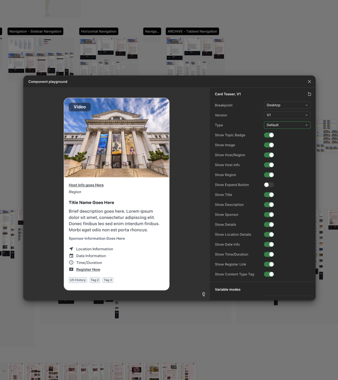
Evolving the card system. The Smithsonian's existing card components worked structurally. I didn't replace them — I tuned them. Adjusted type scale, increased white space, refined corner radius and border treatments, reworked image hierarchy. Small changes individually. Together they shifted the interface from dense and institutional to open and navigable. More product, less government website.
Designing for sparse content. Because the editorial team couldn't guarantee a consistent content pipeline, I designed every state — empty, partial, and full — so the platform held up before the content caught up. The UI had to carry the tonal weight that fresh copy couldn't.
Interest selection that reduces friction. Personalization was built into onboarding: paginated selector screens where users pick topics — space, history, fine art, and others — one category at a time. ZIP code capture surfaced nearby museums automatically. The goal was to spread the cognitive load across steps so the account creation flow felt light, not demanding.
AI-assisted prototyping. I worked with the product strategist using NotebookLM to generate placeholder content for design artifacts, fed with existing Smithsonian content and brand guidelines. Stakeholder reviews became more productive — people reacted to the actual experience instead of mentally filtering out generic lorem ipsum.
the outcome
MySmithsonian marks the first time in the Smithsonian Institution's history that users were asked to create an account. That's not a feature launch — it's a structural shift in how a 178-year-old institution relates to its audience digitally.
Getting there required moving faster than either organization was accustomed to. From kickoff to interactive prototype in three weeks. For a government-adjacent institution where design approval typically spans multiple rounds across multiple stakeholders, the work was presented once — to the Smithsonian's Board and Secretary — and approved on the spot.
  • Fully prototyped flows delivered: onboarding and account creation, interest selection, and event sign-up
  • Design system evolved across 21 museums and the National Zoo — without a rebuild
  • Empty and sparse content states designed and handed off, so the platform holds at launch before editorial scales up