Process
We started by defining the site's structure. I led workshops with stakeholders to define goals and ran a large-scale card-sort study with over 650 customers. The data revealed that users navigated fluidly between discovery, values, and lifestyle content, not just by product category. This insight helped us rebuild the information architecture around behavior.
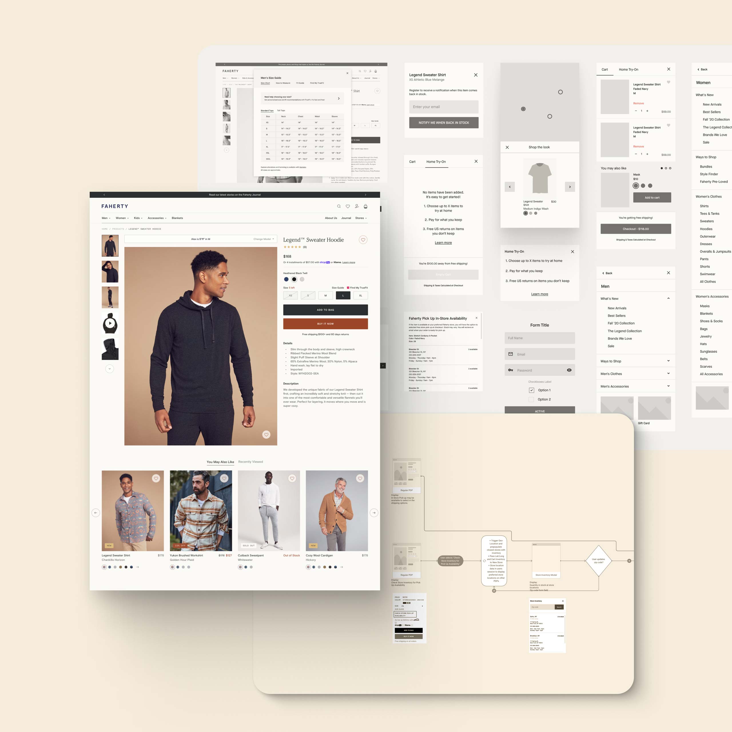
Next, we mapped the full user journey, from discovery to purchase, using Flowmapp, a collaborative visual mapping tool. This transparency improved decision-making and alignment between our team and Faherty's.
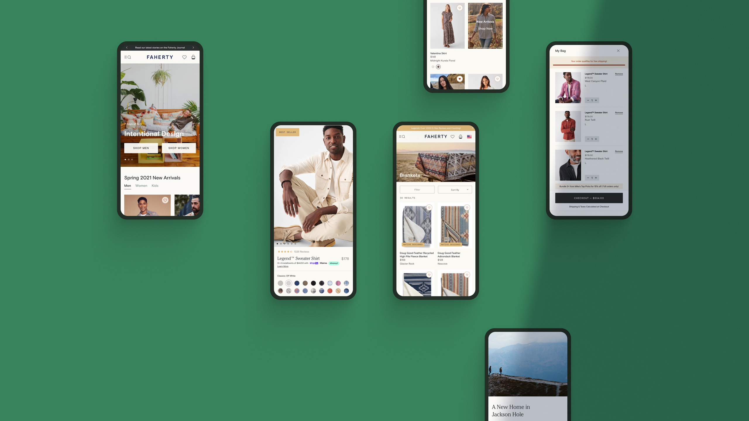
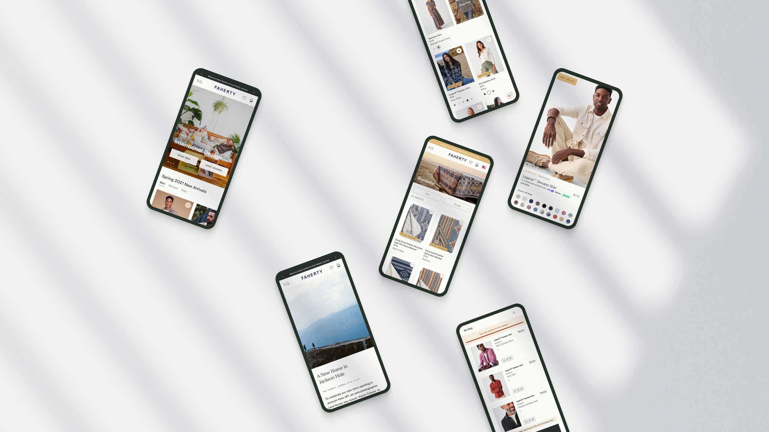
To establish the site's visual language, we created style tiles that tested typography, colors, and photography. Weekly co-reviews with Faherty's brand and marketing teams helped us strike a balance between brand storytelling and performance.
Finally, we translated the approved designs into a modular, tokenized design system. Every element was reusable, empowering Faherty's internal team to create new pages and campaign modules autonomously.